This summer, while my daughter was busy shell collecting and stargazing, she was also outgrowing every stitch of clothing she owned. Clearly, it’s time to move up a size or two. And, at the same time, it’s also an opportunity to make sure her “outsides” keep up with the growth that’s happening on the inside.
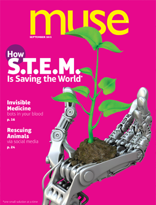
Similarly, as the editor of Muse, I’ve been working all summer on a brand new look for the magazine. Together with art director Nicole Welch, we’ve refreshed the magazine’s design from top to bottom. Nicole believes our readers know—and appreciate—good design when they see it. Cleaning up the page, she says, helps readers really see the content. Bright colors and talented illustrators bring joy and humor to the modern look. We couldn’t be prouder to debut the “new” Muse with the September issue.
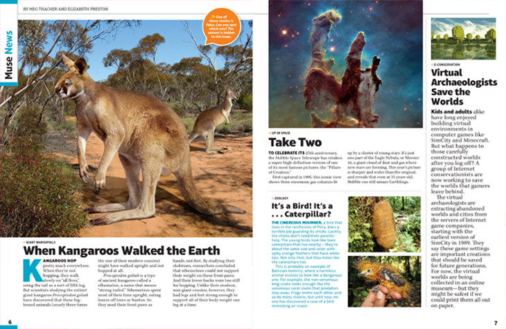
The first things you’ll notice are a vivid cover and bold, edgy page layouts. The magazine may feel a bit weightier too. It has grown by eight pages. When you dive in, I hope you’ll agree that our outsides—in all their pop, fizz, and sophistication—match our insides. At Muse, we are committed to publishing the finest S.T.E.A.M. content for young readers. (“S.T.E.A.M.” is shorthand for our awesome subject areas of science, tech, engineering, art, and math.) Count on us for memorable stories and intellectual rigor but be prepared for whimsy and irreverence too. See, for example, the Muse News below. (Warning: one news story is false. The answer key is hidden in the issue.) Remember, Muse is a verb. It’s for thinkers and dreamers.
This week, my daughter will ask me to buy clothes in her favorite color: “sparkle rainbow.” She’s nearly 5. While it will be some time before she’s ready to turn her keen, curious mind toward Muse, as all parents can attest, growth happens. And the time will go by fast. Perhaps you know a tween or teen for whom our September issue will be the perfect fit. I like to think of it as the sparkle rainbows for the older set.


Johanna Arnone is the editor of Muse.


